Designing the capture interface that turns a living-room TV into a data-collection device for a computer-vision model, where every UX decision is a data-quality decision.
01 · Outcome
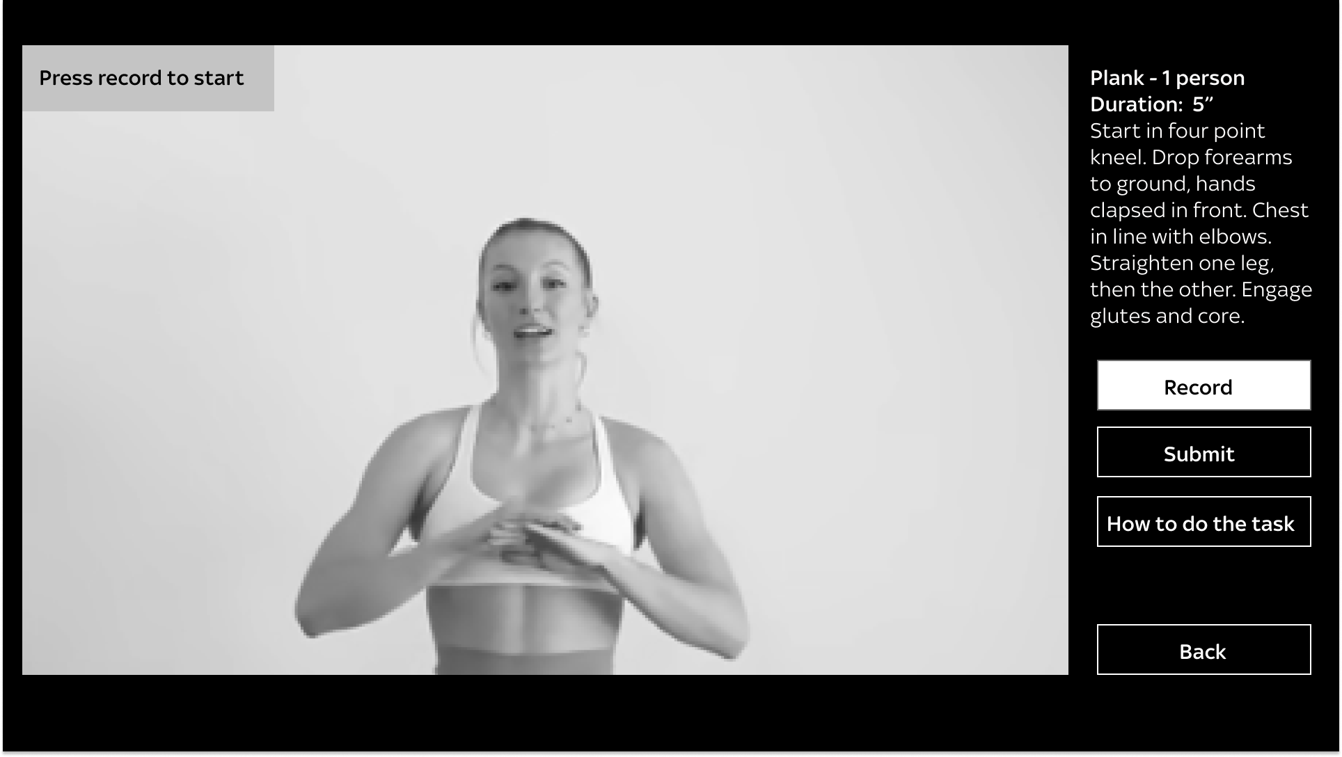
The capture interface became the first quality gate in a five-stage ML pipeline. Treating every screen as a data-quality decision (not just a usability one) lifted training-footage consistency, reduced abandonment at known failure points, and reframed consent as participation.
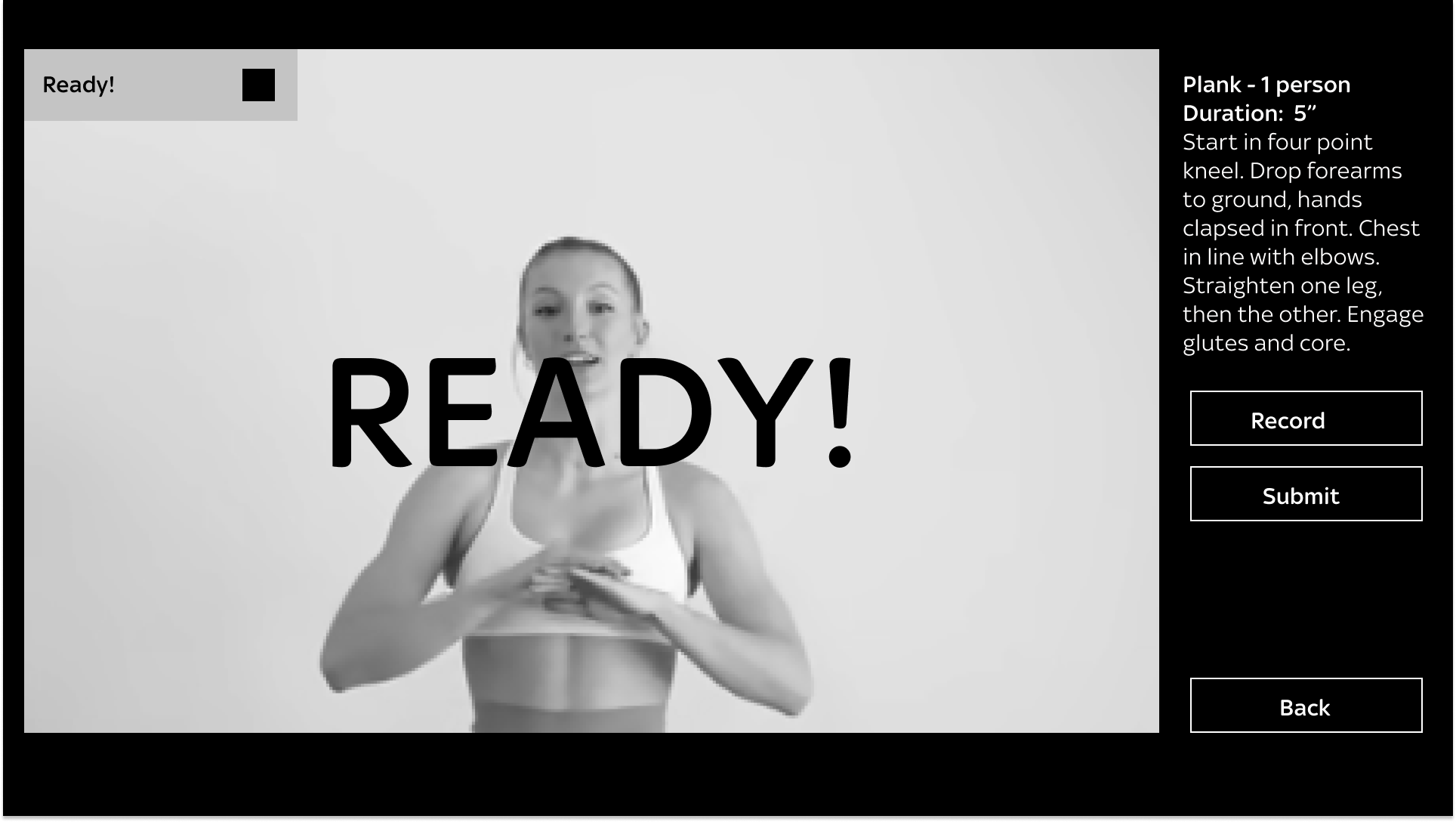
Ready, Countdown, GO! gave users time to enter frame and settle, so videos reached the model in the correct starting position more reliably.
Errors mapped to pipeline stages (camera, network, upload, ingestion) gave users the right recovery action instead of a generic dead end.
Framing consent as training-the-model participation, not legal friction, directly influenced dataset eligibility and opt-in rates.
02 · Challenge
Sky was building a machine learning system that needed real people to record specific body movements to train a computer-vision model. The tool was a TV app running on Sky's Cherry camera. My job was to design the capture experience, where every UX decision directly determined whether a recording could be used for training or had to be thrown away.
The interface was, in effect, part of the pipeline.
03 · How the System Works
Understanding the technical architecture was essential to designing an effective experience. The system works end-to-end as five sequential stages, with UX sitting at the very top. The clarity of the capture interface determines whether the data that reaches the model is usable.
Auth0 sign-in connected to Sky's Azure AD. Consent is enforced as a hard gate before any recording begins.
Structured tasks: a movement or pose to perform, each with a name, duration, and step-by-step instructions.
The Cherry camera auto-selects recording mode based on resolution and frame rate. Adaptive, not designer-driven.
Recordings upload to AWS S3, triggering an async processing pipeline via EventBridge, Step Functions, and Lambda.
Processed videos enter the ML training dataset, the final destination of every recording.
04 · What the Model Needs
The capture interface was training a custom classifier built on top of Google's Pose Landmarker, a pre-trained model that maps 33 body landmarks (shoulders, elbows, hips, knees, ankles) in 3D coordinates. The Google model only tells us where people's joints are, it doesn't know what a plank is. Our classifier learns to recognise specific body positions from that landmark data, so every recording had to clear the upstream model first. Pose Landmarker has a confidence threshold of 0.5: frames where landmarks fall below that score are dropped entirely. It also requires full body visibility, works best from a side-on angle, and defaults to detecting one person.
Every task instruction is a landmark requirement in disguise.
→ Camera-dominant layout. Users self-check positioning before recording so more frames clear the threshold.
→ "How to do the task" reference image. Teaches the framing the model needs, not just the movement.
→ Ready, Countdown, GO! sequence. Users settle into the pose before capture, so the model gets high-confidence landmarks from frame one.
→ "Plank, 1 person" task label. Task metadata mirrors model configuration, not just user-facing copy.
05 · The Design
Seven states designed to reduce uncertainty, improve data quality, and give users confidence at every step.
The initial screen sets the split-screen layout: ~80% live camera preview, because what the camera sees is what the model trains on, and a persistent right-hand panel with task name, duration, and instructions. "How to do the task" is available as a pull, not a push, so confident users go straight to Record.
Tapping "How to do the task" replaces the live feed with a reference photograph of the correct pose. Showing the ideal position teaches users what a good recording looks like before they make one, guidance that serves the pipeline as much as the person.
Borrowed from sports timing: "READY!" gives time to enter frame, the countdown gives time to settle, "GO!" removes ambiguity about when recording is active. Each phase prevents users from starting a recording out of position.
After recording, users see the final frame with two clear options: Re-take or Submit. Knowing they can try again means users are more likely to produce a higher-quality recording on the second attempt than to submit a bad one under pressure. "Your video is submitted" closes the loop.
06 · Key Design Decisions
Reflection
The user isn't simply a person completing a task, they're an operator in a pipeline. Their understanding, accuracy, and confidence directly affect the quality of the model being trained downstream.
Designing to the pipeline's constraints produced better outcomes than designing from the user journey alone.
The highest-impact decisions mapped invisible system failures to clear recovery actions.
Reference imagery, launch timing, and Re-take agency all implicitly taught users what good training data looks like.
The interface is part of the pipeline. Every design decision is a data-quality decision.