Sky · TV / Gaming · 0→1 MVP

Play Along

TVs on, phones ready, let the quiz begin. Designing a multi-device quiz platform that turns the living room into a game show, from blank canvas to shipped MVP on Sky TV.

My Role
Lead Product UX Designer
Platform
TV (EntOS) + Mobile
Status
MVP Released on Sky TV, v2 in progress
Year
2025

Shipped and validated

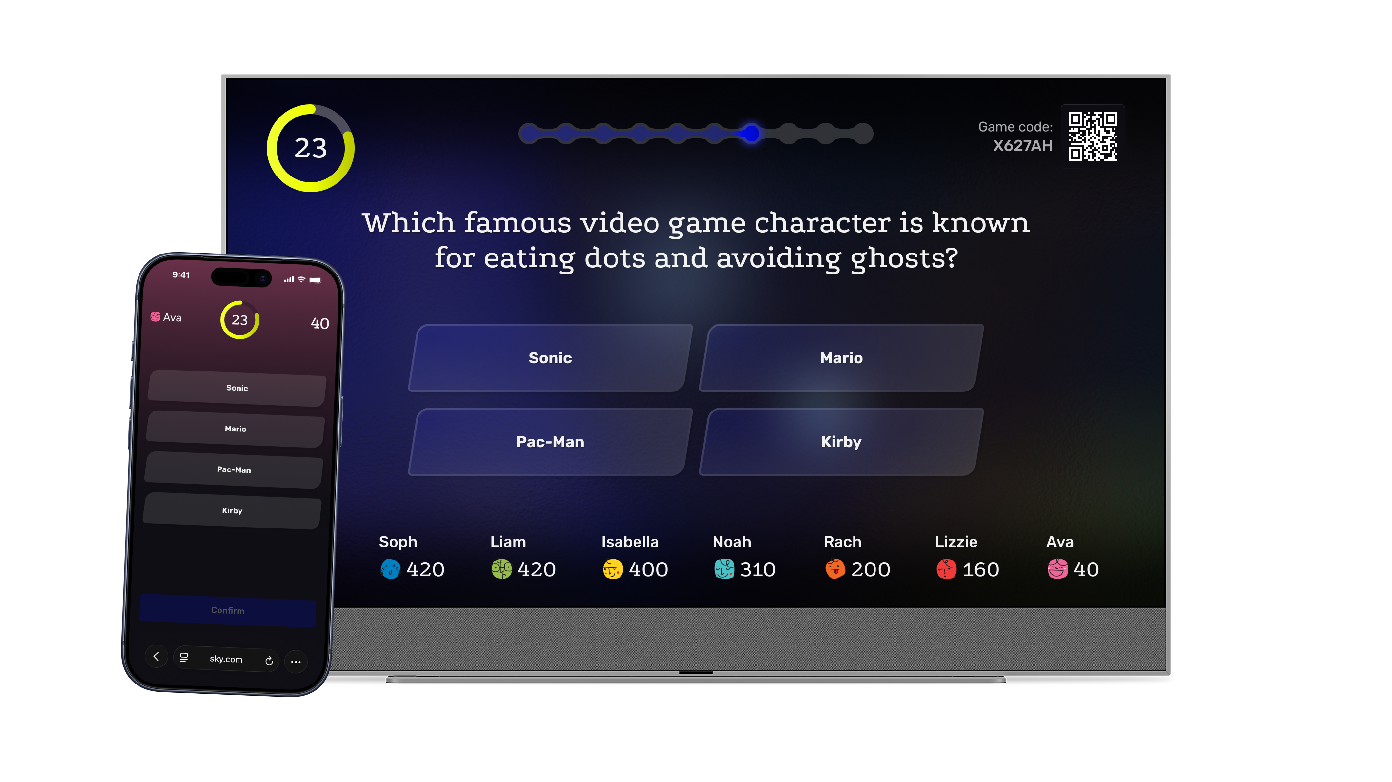
Play Along launched on Sky TV as the first multi-device multiplayer quiz experience on the platform. Staff trials with 32 respondents validated the core interaction model before public release. Post-launch data confirmed sustained engagement, with sessions averaging over 8 minutes and roughly 1 in 3 launches resulting in a quiz being played.

~30%
Launch-to-play conversion rate
~2-3
Average players per session
~8 min
Average session length

Modular design system

The interaction model and UI framework were designed to reskin for any IP, from general knowledge to branded experiences like Bollywoof, without rebuilding the core experience.

Feedback-driven iteration

Trial insights directly shaped the v2 backlog: dynamic timers, audio cues, session resilience, and improved QR ergonomics were all prioritised from real user feedback.

Play Along gameplay showing a quiz question on TV with the phone controller alongside

The problem space

Gaming is outpacing traditional TV: 16-34s now spend 114 min/day gaming, 82% of Comcast households are gamer households, and the industry is worth over $200bn. TVs are increasingly becoming gaming platforms through cloud gaming, removing all entry friction.

Sky had already proven the appetite for interactive TV, but no one had cracked a multiplayer, social quiz experience that bridged the TV screen with the phones already in everyone's hands.

We had the Millionaire app as a foundation, but the goal was to expand into casual gaming and open up the capability and IP to partners.

How might we turn passive TV time into interactive, shared moments that bring families and friends together in the living room?

The brief

  • Design a 0-to-1 multi-device quiz platform for Sky TV
  • TV acts as the host screen, phones become controllers
  • Modular enough to reskin for any IP
  • Simple enough that anyone can join in seconds
  • Social enough to make the living room feel like a game show

The constraints

  • Built on EntOS with web-based phone connectivity (no app install)
  • Support up to 8 players
  • TV remote only until the selection of the quiz
  • Scale from general knowledge to branded IP experiences without rebuilding

The interaction model

Four principles anchored every decision: modular, unite the living room, instinctive by design, inclusive for all. From those, three interaction calls shaped the whole dual-screen model.

TV as host, phone as controller

Once the host hits start, the TV runs the show. No remote fumbling, phones handle input.

Confirm before submit

A two-tap pattern (select, then confirm) prevents accidental answers when the countdown piles on pressure.

Attention ping-pong

Shared on TV, private on phone. Attention bounces between the two, with built-in pauses for reactions and banter. The TV anchors the room.

Key decisions and trade-offs

Phone controller: confirm-before-submit flow

Confirm before submit, not auto-submit

The default pattern in many mobile games is auto-submit: tap your answer and it locks in. We chose the two-tap pattern (select, then confirm) after competitor research and playing through similar games ourselves. Auto-submit punishes misclicks, and with a countdown running and people shouting across the room those happen constantly. The extra tap is a small price to protect the player from an irreversible mistake at second 3.

QR code, not a typed room code

The long-term plan is both: QR as the default, a typed code as a secondary way to join. For the MVP we shipped QR only because it was faster to implement and removes the friction of typing on a TV remote with a D-pad. Code entry sits in the roadmap as a v2 capability for contexts where a QR scan isn't practical.

Persistent top and bottom bars

The layout follows established TV UI patterns: persistent zones for orientation at the top and social presence at the bottom, with a flexible main area between them. The zones are defined in the IA as modular regions, so new quizzes and IPs plug in without rebuilding the frame. Keeping them persistent through gameplay was also faster to implement than transitioning the UI in and out.

Information architecture

A three-zone TV layout, built as a system so new quizzes and IPs could plug in without rebuilding the frame. The top bar (QR + timer) and bottom bar (players) stay persistent throughout the experience, while the main area swaps between lobby, gameplay, and final scores.

Information architecture diagram

TV flow: the shared stage

The TV guides the room through the experience. It never requires input from a phone to progress, keeping the pace for the group.

Shaping constraints with Product, Engineering, and Design

The 8-player cap was a design call, based on what fits comfortably on the TV and the typical group size in a living room setting. The no-app-install condition came from Michael McCourt, Head of Product, as a launch requirement. We built the platform with the CPS-Blue engineering team, and I worked closely with George Grover, Senior UI Designer, on the visual system and with Dylan Haslam, Senior Game Designer, on gameplay rhythm and pacing. The confirm-before-submit pattern needed Engineering alignment because it added a state to the answer flow that wasn't in the original spec; framing it as player protection rather than added friction moved it from a design preference to a shared decision.

What I took from it

Orchestrating attention

Getting the rhythm right between TV and phone in a shared room.

From product to capability

Designing a reusable platform, not just a single experience.

Validation-driven iteration

Test early, listen closely, prioritise ruthlessly.

What I'd change

v1 shipped barebones. The interaction model held, but the UI in several flows was thinner than we'd have shipped with more time. v2 is where that gap closes, with weekly releases pushing craft improvements and the product expanding from a single quiz into a reusable capability for other IPs. The lesson: planning the capability architecture from day one, rather than retrofitting it after v1, would have saved us rebuilding for v2.

← All case studies Next: Sky Live's Watch Together →