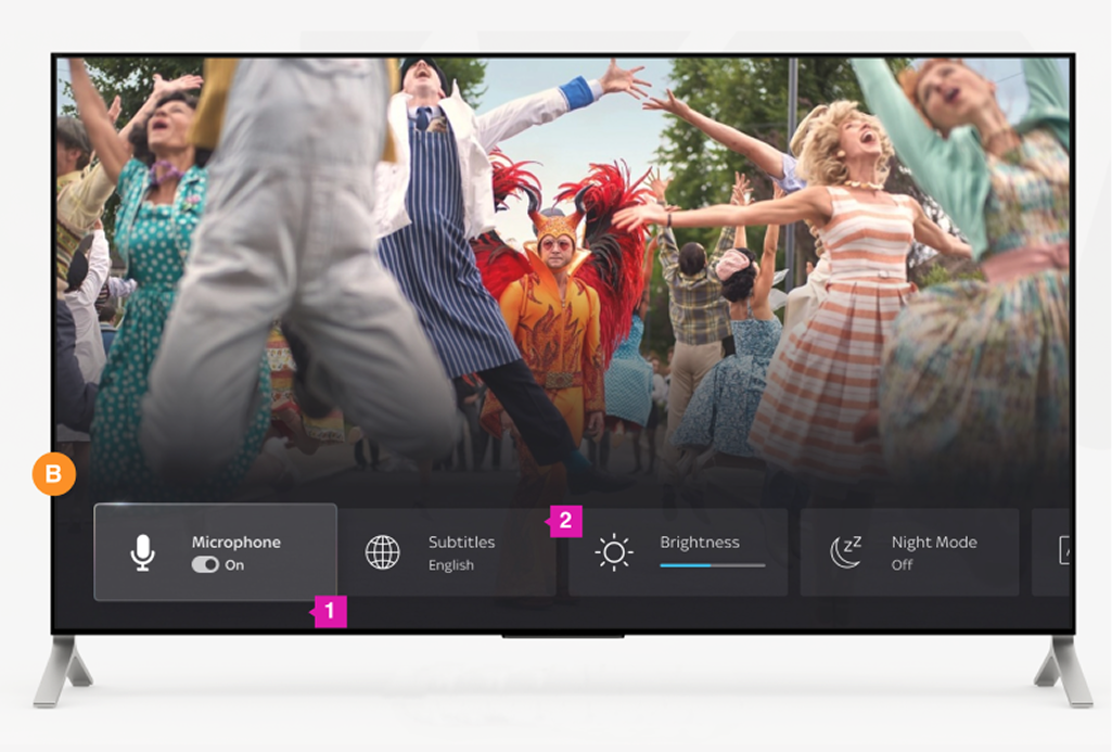
Designing for action: how Quick Access Menu drives a 65% conversion rate in ~32 seconds. A system-level UX layer designed for speed, clarity, and scale.
Outcome
Quick Access Menu launched with Sky Glass, quickly becoming one of the highest-frequency navigational features on the platform. The system layer consistently drives a 65% conversion rate, with users completing their intended actions in an average of 33 seconds, successfully validating the core design principle of effortless access.
*Note: High-volume customer totals have been abstracted to conversion percentages to honour data privacy and NDA guidelines.
Challenge
Sky Glass was built voice-first, the assumption was that voice would handle navigation, including settings, which is why Search and other frequent controls sat +14 rows deep. But voice doesn't always get it right, and not every setting is a one-time preference: things like brightness and volume are occasional, mid-viewing adjustments, not things people think to ask for by voice.
The opportunity: build the fallback, a quick layer for the things people touch often, regardless of whether voice worked. That meant splitting settings into long-term preferences vs. occasional, contextual ones, and designing for the latter.
Voice was the plan. This was the fallback.
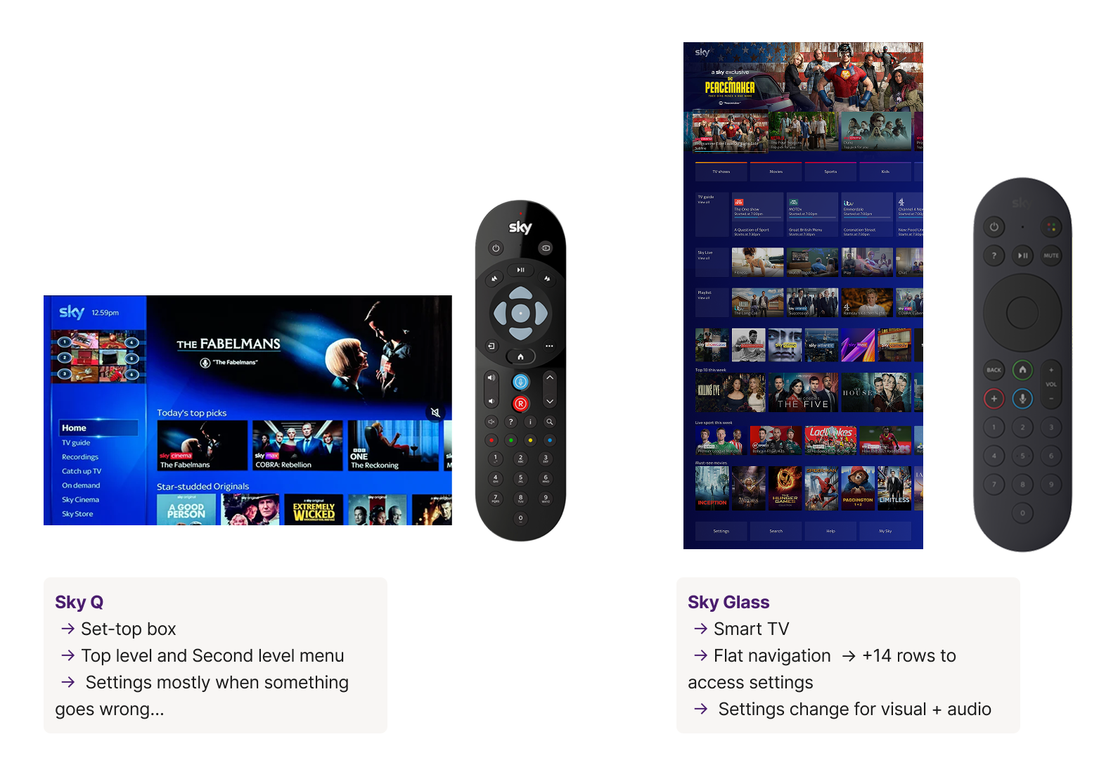
Sky Q's settings were buried in deep hierarchies, designed for a remote-heavy interaction model. Sky Glass needed something faster, more contextual, and built for a new audience.
Sky Glass assumed voice would carry navigation, so frequent controls sat 14+ rows deep. But voice misfires, and some settings, like brightness or volume, are quick mid-viewing tweaks no one thinks to say out loud.
Long-term preferences you set once, and occasional, contextual ones you reach for mid-watch. The opportunity was a fast fallback layer for the latter, regardless of whether voice worked.
Securing a dedicated entry point for Quick Settings meant aligning leaders around repurposing the “?” button. Hardware-level access was essential to delivering instant control. With that in place, we adopted an overlay model and a dual-access strategy, the remote’s “…” button plus the EntOS Settings rail.
How I approached it
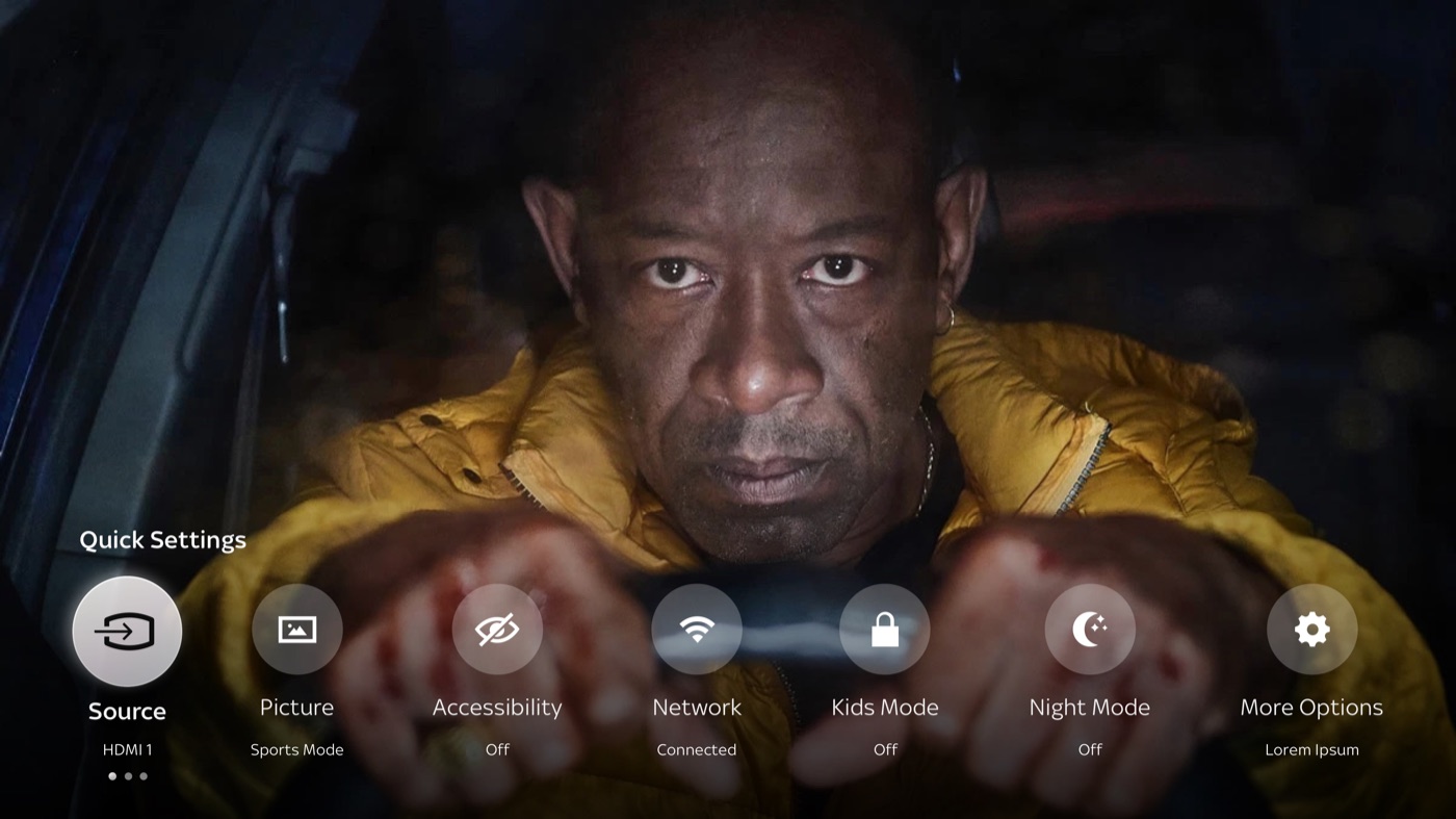
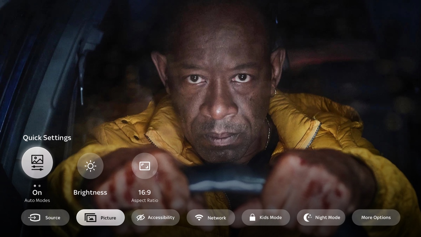
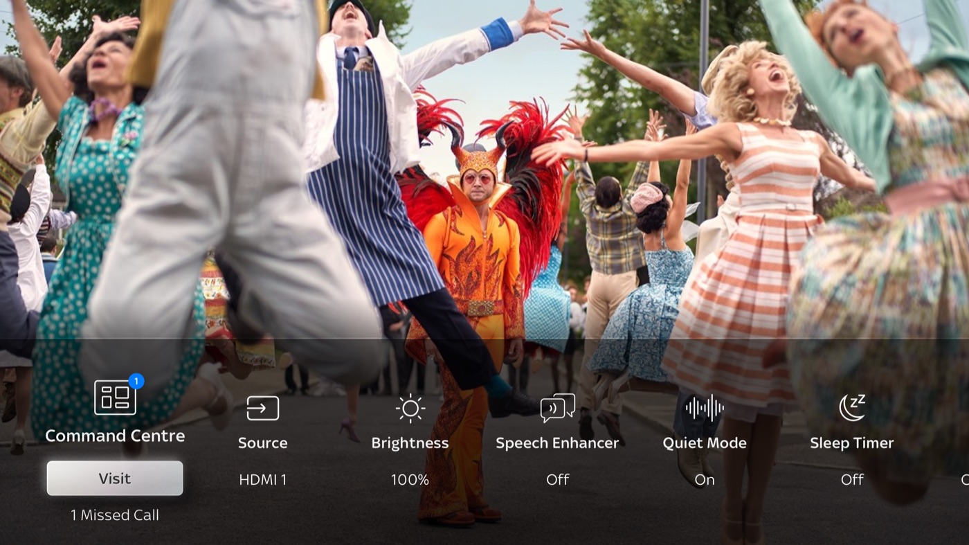
Two initial layouts, a covering carousel and a double-deck structure, looked promising on paper but broke down in testing. Both were trying to solve a layout problem, but the real issue was structural: too many items, nested inside more items. The insight was simple but transformative: flatten everything. One level, one row, no hidden groups.
Rather than designing for specific settings, I defined five core navigational paradigms that became four reusable card components: Toggle, List, Slider, and Link. Every new setting maps to one of these, preserving clarity and consistency as the system grows.
One button press from any state. No hunting, no hierarchy navigation, the most needed actions surfaced instantly.
QAM overlays content without replacing it. Users stay in context, whether browsing, watching live TV, or mid-playback.
Designed to work across Sky Glass and the XiOne puck, a unified experience regardless of hardware variant.
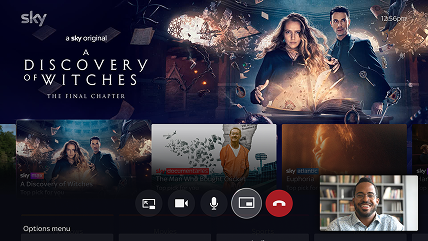
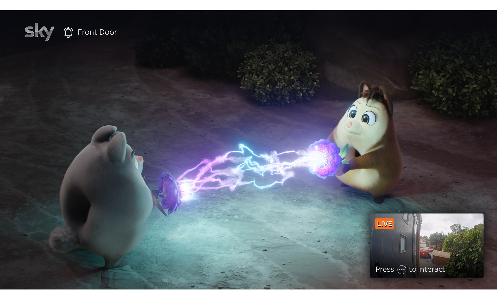
The card-based architecture was built to accommodate new features, proven when it extended to Watch Together PiP and Sky Protect Video Doorbell integration.
Quick Access Menu · Walkthrough
Validation & business pivot
A director-level de-scope removed our planned research window late in the cycle, accelerating delivery.
Our principle: constraints don't lower the bar for rigour, they just shift where you apply it.
Behavioural and Navigational patterns tested
Validated consistency across live TV, VOD, apps, and HDMI.
Ran expert evaluations to assess clarity, discoverability, and error-proofing.
Compared against Samsung, Sony, and LG overlays to balance innovation with familiarity.
We shipped with high confidence despite the constraint, grounded in behavioural evidence, cross-functional scrutiny, and ecosystem-level expectations. Post-launch adoption and error rates validated the approach.
Extended impact
QAM's PiP and overlay patterns became the foundation for Watch Together's co-viewing interface.
The card-based architecture extended to integrate doorbell notifications into Sky Glass.
Reflection
The hardest part wasn't engineering, it was stakeholder.
Reframing a lift-and-shift into a new global Sky Glass feature, then holding the line as scope shifted, descoped then rescoped, ate the moderated-testing window we'd planned. I chose to de-risk on the evidence we could gather rather than hold launch for a study we no longer had time to run.
What I'm proudest of isn't the launch numbers, it's that the same card architecture is still being extended, into Watch Together, into Sky Protect. The real test of a system isn't whether it works on day one, but whether it's still the right foundation years later.
Solve what you're actually being asked, not the brief at face value.
Constraints are design's problem, never the user's.
The architecture should accommodate what comes next.
More work